Today I am posting about creating bar charts,Pie charts and Histogram which are the very important to analyse the given data very easily .
Here the data is given for color of T-Shirt . So we are going to prepare a Bar chart and Pie Chart with the same data.
Open SPSS ---> Go to Variable view ---> Type Shirt in the Name column and String in the Type column as we are dealing with words here. In the label you can write color of T Shirt and rest column keep as it is.


After entering the data now go to Analyze ---> Descriptive statistics --->Frequencies---> Now shift the Color of T shirt variable from left box to the right box---> Click on charts ---> Select Bar chart and follow the same path for Pie chart and instead of selecting Frequencies select Percentage in case of Pie chart . Below diagram shows the variable I have shifted from left to right. For this variable we are making the Bar and Pie chart.

Now click charts tab in that dialogue box and select Bar chart and select Frequencies which is given just below under chat values. Then click continue and ok.

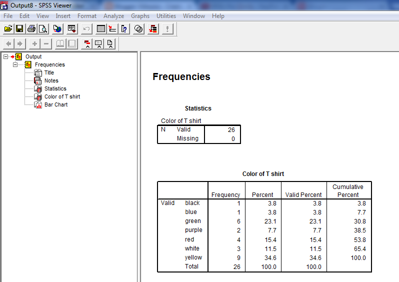
Now below is the Bar chart appearing .


By seeing the pie chart and Bar chart you can easily analyse and interpret the result.
Hope this was helpful. In my next post will show the calculation of Coefficient of Variation.
Ramesh
No comments:
Post a Comment